
Big City’s fresh new website – check it out!
Since 1981 – I’ve been a sign painter and graphic artist creating hand painted graphics, custom signs, and school murals, school awards and more in San Diego, Orange County, Los Angeles and throughout Southern California.
Big City Signs | Graphics is moving into a fresh, new, informative, modern, and pretty nice looking website. Please come on over and take a look!

My sign design projects with hand painted script lettering – 1980’s and 90’s
Back before computers were everywhere, I worked with some businesses to develop a graphic identity for their vehicles, printing, etc. I may have saved the logo design graphics somewhere, if I find them I’ll add photos to this post. Bouncy scripts incorporated into graphics have a unique eye-catching flow to them.
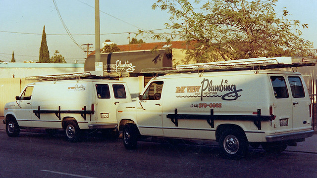
This one – Bay View Plumbing in Redondo Beach CA, was a classic sign painter design that ended up in all their printed pieces, on the vans, magnetic signs, the awning over the office, and who knows where else!
Another plumbing business I designed lettering for – I believe this was the first of a series of plumbing businesses because of referrals – is this one in Torrance CA.

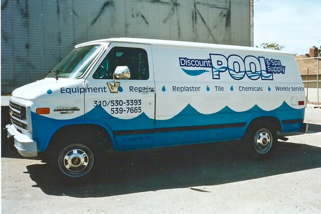
This logo has been used by Discount Pool & Spa Supply in Lomita CA for many years. This was the first van I did for them…
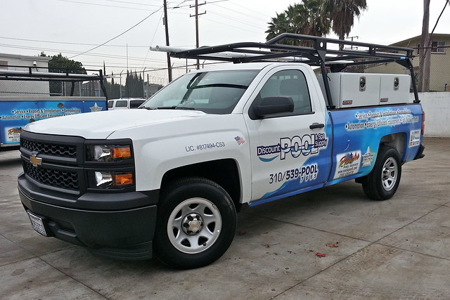
Fortunately we decided to lose the goofy pool water I thought was so clever in later years — still doing their vehicles, but now wrapping them (still using the same logo) like this:
Here’s another plumbing van client that I started working with in that time period, this one in Torrance CA. This is a newer vehicle, done in vinyl – but the bouncy script layout was inspired by years of sign painting.

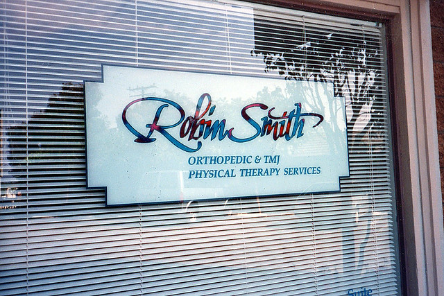
This window signage for Robin Smith Physical Therapy in Manhattan Beach CA used the client’s business identity that included a script-style combined with classic sign painting techniques.
Based on her business card which had the color effect in the name lettering. Hand painted inside glass – started with outlines and descriptive copy (under the name), then stippled color in the name, and stippled white for the translucent effect it provides for the panel. I did this somewhere in the early 1990’s.
Finally, here is one more bouncy, hand painted, sign painter design style (kind of a showcard in banner format) I did around, maybe, 1985…
Sign painters have had a huge influence on graphic design in times past. We can look to all the unique script hand-lettering in (what I think, anyway) was the heyday of advertising and graphic design in the 1950’s and 1960’s.
Hope you enjoyed this post.
Please subscribe to our newsletter at this link for updates! (No spam, I promise!)
Recent work – animal hospital mural
One more hand painted mural project got done recently, at an animal hospital in San Diego, CA. This is the back wall of the hospital which the client wanted to brand. It works well as an attractive visual in the neighborhood, and to tease approaching traffic about what’s in the building. My old sign painting skills got a pleasant place to work on this one, and the client loved it.
Please subscribe to our newsletter at this link for updates! (No spam, I promise!)
Recent work – cost-effective Costco signage
Your humble sign painter got a little cost-effective sign painting in today, for Costco Carmel Mountain in the San Diego area. The manager told me their monument sign’s painted letters didn’t match the corporate logo – I can completely understand why it bugged him!
Here is the “before” picture – the “o'” and “s” shapes were wrong in “Costco”, and the “s” was the same odd shape in “wholesale”.

After taking careful dimensions I went back to the shop to prepare. With the proper logo in hand, I created the paper pattern to transfer the design to the monument, to know where to paint – and paint out the malformed letters.
On site, I matched the background color by eye, then painted out the offending letter shapes.

Then, on to painting the client’s correct corporate logo. I also took a moment to refresh all the red, since it’s a color that fades easier than others..
Here is the final result – hand-painted cost-effective signs have created another happy customer!

Please subscribe to our newsletter at this link for updates! (No spam, I promise!)

You must be logged in to post a comment.