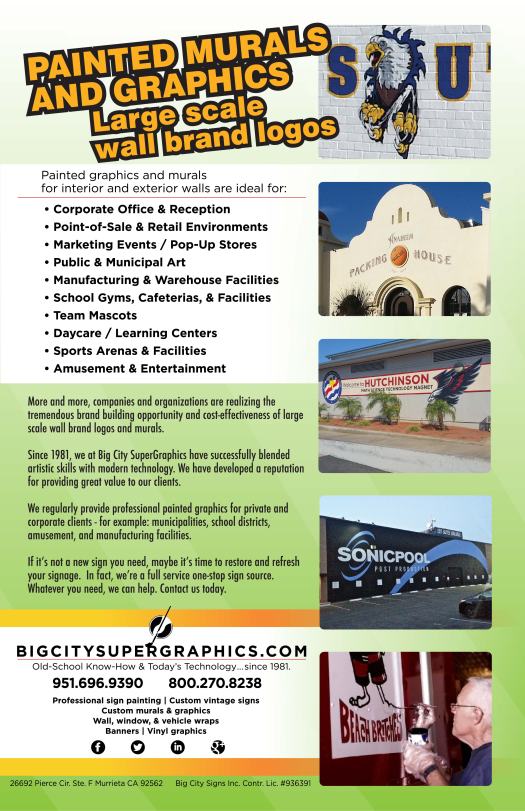
Painted Graphics – our brochure

Your GO-TO sign painter – Old school know-how with today's technology – since 1981.
Big City provided a school mural at the entry to the school recently for Hutchinson Middle School in La Mirada, near Los Angeles in southern California. Here’s the final product:

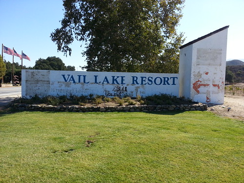
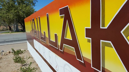
Recently Big City had the opportunity to provide painted graphics on a two-sided 6 ft x 40 ft monument sign. Painting the graphics provided cost-effective signage for this large “canvas”.
Here is what it looked like originally – I’d say it was ready for a change:
The process of providing new signage typically follows the path of settling with the client ahead of time on what we’ll be doing. A scale rendering and photo mock-up are typically provided, here is that documentation for this project:

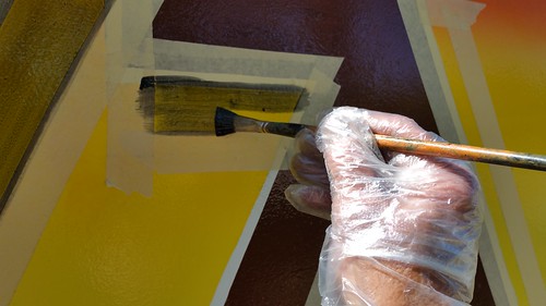
With approval from the client in hand, the graphic production begins. As documented elsewhere in this blog, full-size paper templates are drawn and perforated with tiny holes on the drawn lines. Charcoal is pushed through the holes on-site to transfer the design to the sign surface.
Next, I began laying in colors. The colors were intensified here, as signs need to be less subtle than printed materials to be properly eye-catching.
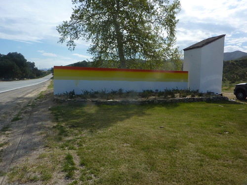
More colors were painted, and the design began to take shape.

Part of the design included a transparent shade, that shows the background colors through it. Here are a couple of detail shots of that:
The layout is almost always printed out in full color at scale to be able to see what we’re trying to accomplish, and as paint colors are mixed they’re tested on this scale rendering:
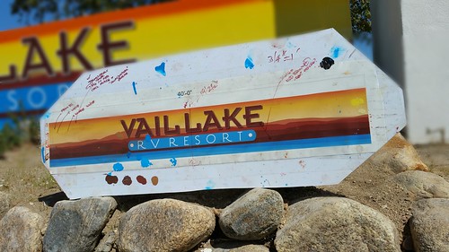
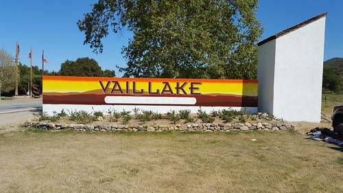
The final result:


When I work with clients, the pre-job presentation is part of the process many have expressed appreciation for. You know just what you’re going to get, beforehand – and edits can be made until you’re happy with it. The result, then, will be exactly what you want.
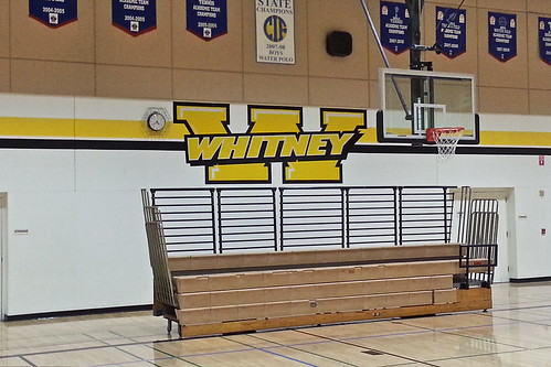
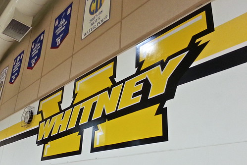
Here’s an example – as well as another School Pride painted graphic, resulting in another happy client.
It started like this:

And when completed, looked like this:
#supergraphics

You must be logged in to post a comment.